There has to be far more to photography, than just recording a moment in event, or creating pretty picture postcard shots of animals, flowers and scenery. After all, almost everyone can point and shoot a camera, grab a quick shot with a mobile phone or similar device, yet some photographers seemed destined for acclaim, while others sit amid the sea of 'want to be,' almost drowned in the oceans of images swamping our world.
What is the secret, that determines whether a photograph is a good or poor shot? More importantly perhaps, what can be learned towards honing photographic skills to propel and encourage acclaim, fame and perhaps fortune.
Knowledge upon the basic principles of Composition is possibly the key place to start looking for some of the answers, and the Rule of Thirds and Centralisation are probably the two most common principles that spring to mind; quickly followed by, those 'questionable errors' of Halving and Distractions. Yet all these aspects in composition may be more simply described as Comfort and Discomfort, and it is ultimately the use and or combination of these and other compositional elements, that determines whether the image gels together and or screams out an inevitable "Wow."
So here are a few itemised thoughts towards achieving a good composition in photography.
Rule of Thirds - Where a main element or subject within the image is placed vertically or horizontally a third of the way in from an edge of the view. There is no Law towards an exact measurement, simply as the placement is in an area described as a comfort zone, defined by the brain as it determines; to the right or to the left, to the top or to the bottom.
Centralisation - A main element centred in an image draws immediate attention. Again in an area the brain generally considers as a comfort zone, with perhaps the exceptions being where the element is considered to be alive, or moving in a particular direction and naturally like us, requests an additional element of space to the fore.
Halving - Where an element divides the image into two similar sized areas either side, causing the brain some un-requested disruption to question where to look next, right or left, up or down. Normally described as something to avoid (as it can be consider detrimental to split the whole) sometimes, this apparent negativity is exactly what the image requires, expressing what it is all about, and there, to make the viewer think beyond their initial impression.
Distractions - The bits in an image that jar on the eye, interrupting the flow as you survey the scene. Like the little areas near the edge of a photograph that trap and trip, holding or throwing your gaze away from the main subject. Generally, such distractions provide negative imbalance within a composition, underlining the importance as to how a shot is lined up or edited. Sometimes, it is simply a matter of using a little Dodge or Burn to alter a tone value, with perhaps a gentle blur to soften a crisp contrasting edge. While at other times, it maybe more appropriate to use harsher methods, from over painting with an Airbrush or Clone tool to cropping and re-sizing the image.
Sometimes a pictorial distraction may be a question of personal taste, subtle in nature, or overlooked first time round. Post processing subjectively and objectively at the same time is an art in itself, and rushing at the job in enthusiasm for a shot, is something I personally have to discipline myself upon.
Lead in Lines and Perspective - These are useful aspects towards directing or drawing the viewer's eyes to areas in a composition. Subtle changes in tonal values may also act in a similar fashion, catching the voyeur's attention and encouraging their eyes to roam or weave around a photograph. Combining such elements can increase interest; while a too busy image, may inadvertently confuse and drive the audience away.
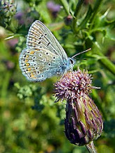
DOF - Depth of field can also play an important role in a composition, defining the areas you wish to be in sharp focus. I still find myself using a central or spot focus (with AF/AE lock) and swinging right or left (towards the rule of thirds) to determine the compositional balance I desire, before taking the shot. Coupling DOF with some interesting lighting, and images can become very atmospheric.

For this shot, a ground marker (for AE/AF lock) and a 10 second shutter delay was used. Giving me the time to get into position, call the dog to heel, and adopt a pose..
Crops - The term "too tightly cropped" is often used in form of critique, to describe images that appear trapped, cut off by, or squeezing some imbalance into the viewed frame; where there is no apparent reasoning for leaving an area to be kept out of the image. Likewise, "a tighter crop might be better" is usually followed up by some reasoning to perceived unnecessary space, or the sense of a dead area providing an imbalance in the composition, drawing the eyes away, or detracting from the main subject being portrayed.
Cut Off - I'm throwing in the term 'Cut Off,' to highlight the 'in vogue' aspect of the so called trendy portraiture shots; you know, the ones where the tops of heads are missing! Of course I am not against tightly cropped portraits that highlight a pair of beautiful smiling eyes or a watery wart on the tip of an old gent's nose, but the shape of the head, hairstyles, etc., form a Natural frame in themselves. So that sometimes, less is not necessarily more; and just because one 'tightly cropped' model shot works, that does not mean that every cropped portrait will be the bee's knees.

The emphasis here, being the unbothered expression with a tiny insect sitting on the bridge of the nose.
Light - The most important aspect to any composition is the Light, its direction and effect upon the scene before you; and of course the selection in Aperture and Shutter Speed used to make the image. The following photographs, were shot in bright sunshine, and required no post processing trickery to achieve the dark background. Translucent structures can often be very interesting, and seeking out areas of interesting light as you compose the shot may make all the difference.


While a good Exposure is the expected norm in producing or achieving good results; As ideally every pixel (or part of film) in a Landscape scene should hold colour information. Stepping down or up a stop or two to alter the Exposure can provide interesting effects, and I have no problem with achieving the picture you desire in camera, towards reducing the amount of post processing work in the darkroom.
Balance - Most compositions require a sense of balance, through line, shapes or pattern. Incorporating aspects like, symmetry, reflection, echo of lines, textures and patterns, are easy ways towards achieving a balanced photograph. Using the foreground to frame the subject (shooting through an architectural or natural opening) is another. There are a few other, perhaps more intriguing options that include more subtle detailing; like utilising lighter and darker tones of colour to provide the complementing shapes to achieve the balance, either during the shoot, or later in the digital darkroom.
While on the subject of balance, a few thoughts upon wonky uprights, sloping horizons, and the sense when things do not look quite right. Out at sea, a sloping horizon may add to the drama of events; while large ships 'sliding down or facing an uphill' on the distant horizon in a beach scene detailing the shoreline, may appear odd. That said, employing a 'Dutch' or jaunty angle for a shot, can help to emphasise the subject in a creative spirit, and it can be simply a matter of providing sufficient exaggeration to strike the right balance or appeal.
Shots taken from unusual angles or perspectives are always popular in catching attention.

Of course non of the above really answers the earlier question; As a good or poor photograph is simply, subjective to the thoughts and opinion of the audience! No one, can teach you how to become a great photographer, you simply have to train and discipline yourself, and never stop learning!
Finally, here is a photograph that really grabbed my attention. The following paragraph charts my chain of thoughts to the conclusion, that it is one of the best photographs I have seen in quite a while. (Safe to say, permission of use was granted by Alan Abercombe prior to writing this article.)

Drawn by the overall intensity of colour, the lone figure speedily stood out - a dark stilled poise {observer/relative) wearing red hat and shoes standing in an area of shadow - The red wreaths of Poppies - 'Yowh!' If it had been me, I would have included all of the wreath on the left. (Fortunately) The dominant uncluttered light blue area to the right calls, and I notice the carved details, the poppy crosses, and the place names; while withdrawing to view the whole again. - The intense blue strip and cropped wreath appear to battle away on the left, while the almost empty light blue block halving is almost soothing? - Instinctively, half closing my eyes (to shut out the effects of side light, so that I am just observing the differences in tone) I indeed see two distinct halves; Clever photography. - War & Peace, as my eyes temporarily meander in the light block - the place names - and the autumn leaves lead back to the shoes. - The sadness - the scale of place - lives lost and shattered - walks of love - names - personal names - Innocent children buried in rubble - the cycle in the historical reality of Life - Peaceful Blue sky reflected in polished granite - Red Shoes and Granite.
Obviously, the above pattern in thoughts led to my own personal opinion and conclusion, that the photograph is one of merit able worth; It physically evokes thoughts beyond that which it contains and portrays. The well-executed post processing provides sufficient means to remain observing the view, while the imbalance has purpose; with the photographer's knowledge, skill and creative ability, combining to provide a fine balanced composition, strong enough to inspire this article into being.
Others will have their own view and opinion upon the shot, simply as we all come from different backgrounds and interpret things in our own personal way, likes and dislikes; Photography is subjective.
However, the reason for including it in this article, is that it demonstrates, the ability to identify, and cash in on the full potential seen and recorded through the lens, using accentuated processing techniques that only come through experience, experiment and practice. Striking the right balance in each composition is all part of the Art, and taking the time to thoughtfully post process a photograph can make all the difference.
You can see more of Alan Abercombe's photography here http://www.alanabercrombieimages.co.uk/
© Article Copyright all rights reserved Andy D Kemp 2013